
PRODUCT DESIGN CASE STUDY · 2026
StudyBuddy
Help without losing your place.
ROLE
Product Designer · Solo
PLATFORM
iOS
There's a particular kind of tired that comes from studying alone at night with a phone as your only tool. Not the tiredness of the material itself, the tiredness of managing everything around it: which lecturer posted which file, where you left off, whether the AI app open in another tab actually understood the question you asked it. StudyBuddy starts from the belief that most of that tiredness is not necessary. It's a design problem, not a discipline problem, and it's solvable.
The person this had to work for
I built this around one student, deliberately narrow rather than broad: a 200-level Nigerian university student, three courses running at once, studying on her phone because it's the device she actually has in her hand at 9pm, not because it's the device anyone would choose for reading dense material. She's not behind. She's not disorganized. She's managing a genuinely fragmented system that nobody designed on purpose, PDFs dropped into WhatsApp groups with no folder structure, lecturers who each have their own way of sharing material, and a two-hundred-person class group chat that is the last place she'd post "I don't understand this."
"I don't have time to read this twice."
That line, pulled out of the empathy work that opened this project, ended up doing more design work than almost anything else. It reframed the whole premise. The product isn't competing with tutoring, and it isn't trying to be a better PDF viewer. It's trying to remove the tax she pays every time she has to leave a page to go find an answer, and then find her way back to where she was.
A second, quieter insight sat underneath that one: the disorganization isn't a personal failing, it's structural. Three lecturers, three habits, zero shared system. Any real solution had to fix the filing problem and the understanding problem together, because a beautifully designed reading assistant sitting inside a chaotic folder structure solves half a problem convincingly and the other half not at all.
The idea, in one sentence
Get help with what you're reading without ever leaving the page you're on. Everything in this project either serves that sentence directly or it got cut. That discipline shows up more in what isn't here than in what is, and I've tried to be honest about both throughout this document.
How the design actually moved
This wasn't a straight line from sketch to final screen, and I think pretending it was would undersell the more useful part of the process. Three real pivots are worth naming, because each one changed a genuine assumption, not just a color.
From dark to light, and back to a considered light
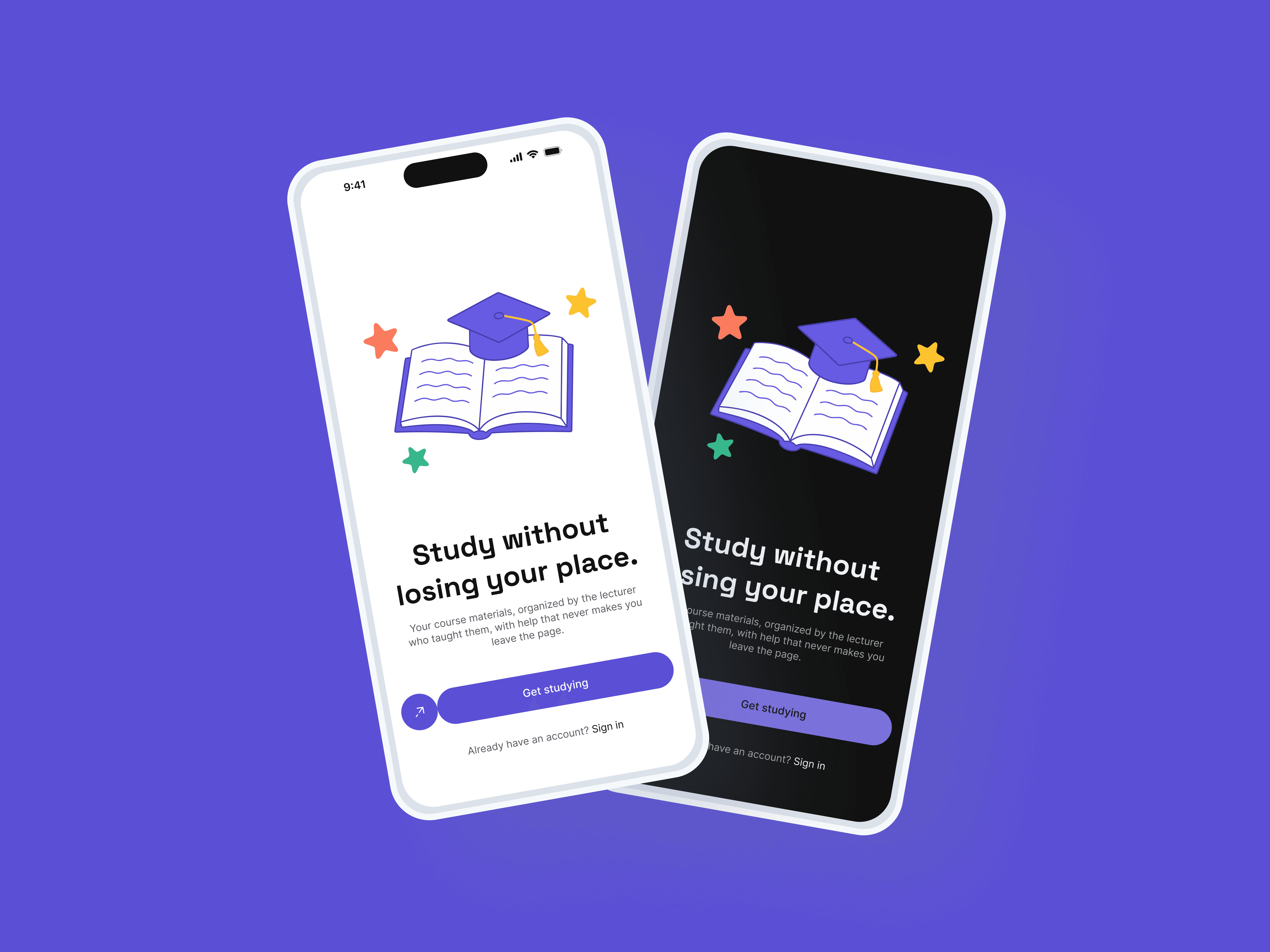
The interface went through a full dark-themed phase, built around the idea that a late-night study tool should look like it belongs at 9pm. It wasn't wrong, exactly, but once real content and real interactions were sitting inside it, a white, high-contrast surface with bold typography did a better job of one specific thing: making dense academic text, equations, worked examples, long paragraphs, genuinely comfortable to read for more than a minute or two. Readability for the actual reading screen won out over mood-setting for the icon-and-marketing screens. Dark mode didn't disappear, it became a fully specified second mode rather than the whole identity.

The nav bar that pointed at nothing
Early on, the interface had a three-item bottom tab bar, Home, a middle tab, and Profile. The middle tab looked reasonable in isolation and fell apart under one question: where does it actually go? There was no real destination behind it, no independent screen that made sense to land on directly. Removing it wasn't a simplification for its own sake, it was the correction of an actual mistake, a tab built because the pattern is common, not because this product has three peer-level sections. What's left uses an avatar tap for anything account-related, and every screen gets its full height back instead of giving up 60 pixels to a bar defending a destination that didn't need defending.
Sheets that were technically correct and still felt thin
Every bottom sheet in this product, adding a lecturer, uploading a document, confirming a join, went through a second pass after the first version shipped. The first pass was functionally fine and visually forgettable, a title, a close button, a form, done. The version that replaced it commits to a small icon badge, a real headline and subtitle, a divider, then content, with enough padding that a short sheet still reads as a considered surface rather than a strip of UI that happened to appear at the bottom of the screen. The lesson underneath this one: a component being structurally correct and a component actually looking finished are two different bars, and it's worth checking both.

Walking through the product


The design system underneath it

If I were shipping this
Everything above exists. What follows doesn't, and I want to be precise about that line rather than let ambition blur into implementation. These are the features I'd genuinely want in a real version of this product, in roughly the order I'd tackle them.
The reading assistant's actual interaction, built out in full.
Right now the Document Reader shows what the content looks like. What it doesn't show yet is the mechanic that makes this product different from any other reading app, highlighting a line and asking about exactly that part, choosing a page range and getting a quiz on just those pages, a gentle prompt at the end of a session asking if you want to check what stuck. That loop is the actual thesis of this product, and it's the first thing I'd build if I picked this back up.
Search.
Once a student has real material across several courses, being able to type "removable discontinuity" and jump straight to the page, instead of remembering which lecturer's folder it's in, stops being a nice-to-have.
Notifications, done properly.
A synced classroom getting new material, a quiz result ready to review, this needs a real home, not just an icon with a dot on it and nowhere for the tap to land.
Offline access.
A student studying from data on her phone shouldn't lose access to a document she already opened once just because the connection dropped. This matters more here than in most consumer apps, given who the product is actually built for.
Real instrumentation.
Which pages get highlighted most, which quiz questions get missed most often across a whole class, feeding back to help a lecturer understand where a cohort is actually struggling, not just to help the individual student. That's a genuinely different, bigger idea sitting one layer beneath this one, and it only becomes possible once the core loop above is real and running.
Read more of my case studies


